
 apocalypse" />
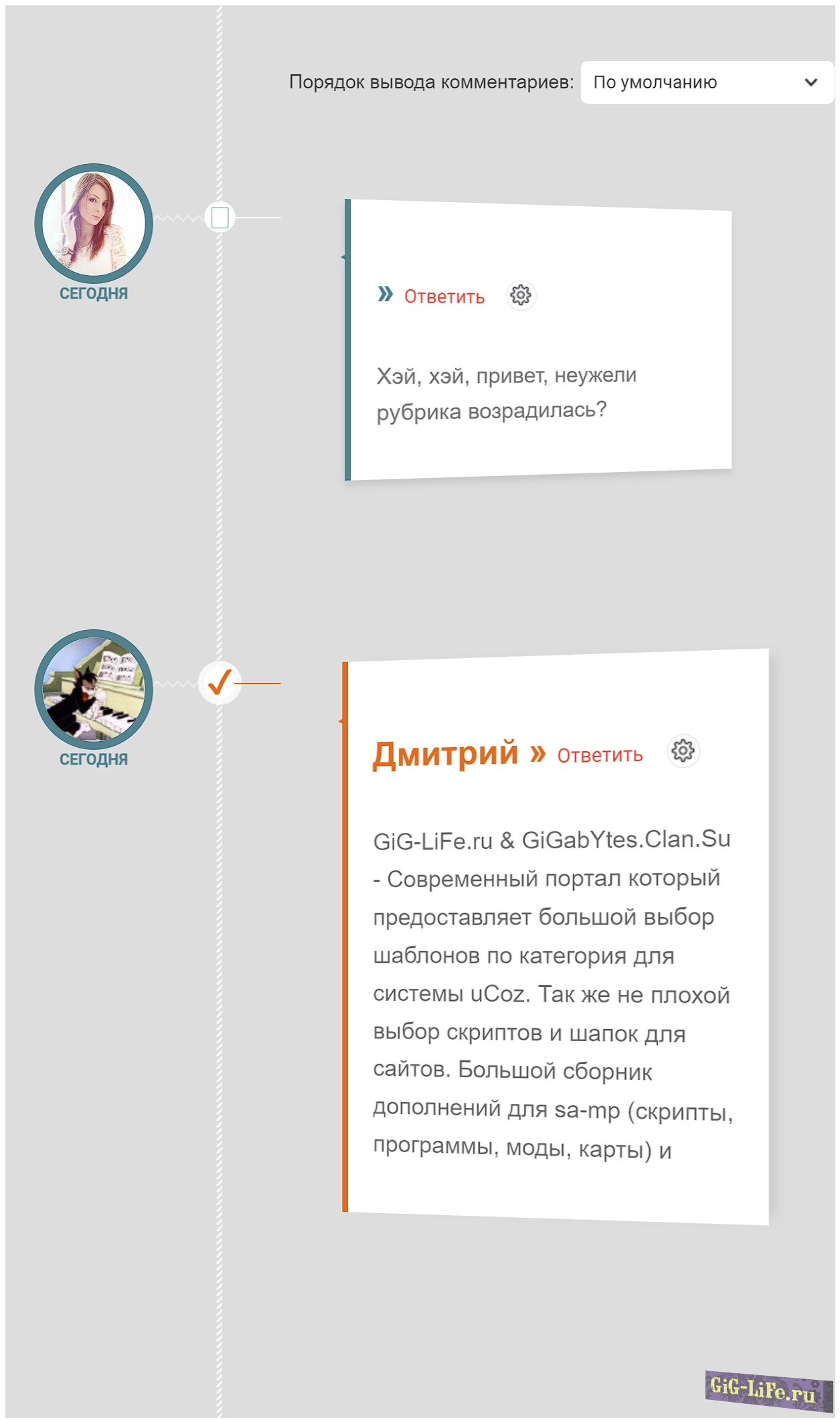
Невероятный харизматичный облик комментариев, созданный в 3D-стиле, безупречно смотрится на разных визуальных макетах. Этот тип комментариев полностью функционален и отображается одинаково в любом браузере, а установка занимает всего лишь несколько минут. Автор вложил силы и талант в это произведение.
Установка:
В самый низ вашего css вставляйте:
/*--ubutton-fix--*/
 .myBtnLeft img, .myBtnRight img, .myBtnLeftA img, .myBtnRightA img, .myBtnRight + td input, .myBtnRightA + td input { display: block }
 .myBtnCenter, .myBtnCenterA { line-height:19px !important }
 .myBtnCont { height:19px; padding-bottom:0 !important }

 @font-face {
 font-family: 'fontawesome-selected';
 src: url("//gig-life.ru/s/web/uCoz/Profiles/1/fontawesome-selected.eot");
 src:
 url("//gig-life.ru/s/web/uCoz/Profiles/1/fontawesome-selected.eot?#iefix") format('embedded-opentype'),
 url("//gig-life.ru/s/web/uCoz/Profiles/1/fontawesome-selected.woff") format('woff'),
 url("//gig-life.ru/s/web/uCoz/Profiles/1/fontawesome-selected.ttf") format('truetype'),
 url("//gig-life.ru/s/web/uCoz/Profiles/1/fontawesome-selected.svg#fontawesome-selected") format('svg');
 font-weight: normal;
 font-style: normal;
 }

 .timeline {
 position: relative;
 list-style-type: none;
 padding: 30px 0 50px 0;
 font-family: 'Gorditas', Arial, sans-serif;
 width:650px;
 background:#ddd
 }

 .timeline:before {
 content: '';
 position: absolute;
 width: 5px;
 height: 100%;
 top: 0;
 left: 165px;
 background: url(dаta:image/png;base64,iVBORw0KGgoAAAANSUhEUgAAAAUAAAAFCAYAAACNbyblAAAAJUlEQVQIW2NkQAP/gYARWQwkAOLDBeECjEAAkkEWAKtEFwAJAgAZEBP+oM1IkwAAAABJRU5ErkJggg==);
 color:#aaa
 }

 .event {
 position: relative;
 margin-bottom: 80px;
 padding-right: 40px;
 }

 .thumb {
 position: absolute;
 width: 100px;
 height: 100px;
 box-shadow:
 0 0 0 8px rgba(65,131,142,1),
 0 1px 1px rgba(255,255,255,0.5);
 background-repeat: no-repeat;
 border-radius: 50%;
 -webkit-transform: scale(0.8) translateX(24px);
 -moz-transform: scale(0.8) translateX(24px);
 -o-transform: scale(0.8) translateX(24px);
 -ms-transform: scale(0.8) translateX(24px);
 transform: scale(0.8) translateX(24px);
 }

 .thumb:before {
 content: '';
 position: absolute;
 height: 8px;
 z-index: -1;
 background: transparent url(dаta:image/png;base64,iVBORw0KGgoAAAANSUhEUgAAAAoAAAAICAYAAADA+m62AAAAPElEQVQYV2NkQAP/gYARCNDFUQRgirAphitEl0TngxXisg5ZnBGXIpgbYfIYjkb3BNxGbBLYxIgyEaQRAA8KKAWYsZtjAAAAAElFTkSuQmCC);
 width: 51px;
 top: 42px;
 left: 100%;
 margin-left: 8px;
 }

 .thumb span {
 color: #41838e;
 width: 100%;
 text-align: center;
 font-weight: 700;
 font-size: 15px;
 text-transform: uppercase;
 position: absolute;
 bottom: -30px;
 }

 /* Transparent Checkbox/radio hack: leave the checkbox on top, hide it with opacity 0 */

 .event label,
 .event input[type="radio"] {
 width: 24px;
 height: 24px;
 left: 158px;
 top: 36px;
 position: absolute;
 display: block;
 }

 .event input[type="radio"] {
 opacity: 0;
 z-index: 10;
 cursor: pointer;
 }

 .event label:after {
 font-family: 'fontawesome-selected';
 content: '\e702';
 background: #fff;
 border-radius: 50%;
 color: #41838E;
 font-size: 26px;
 height: 100%;
 width: 100%;
 left: -2px;
 top: -3px;
 line-height: 24px;
 position: absolute;
 text-align: center;
 }

 .content-perspective {
 margin-left: 230px;
 position: relative;

 -webkit-perspective: 600px;
 -moz-perspective: 600px;
 -o-perspective: 600px;
 -ms-perspective: 600px;
 perspective: 600px;
 }

 .content-perspective:before {
 content: '';
 width: 37px;
 left: -51px;
 top: 45px;
 position: absolute;
 height: 1px;
 z-index: -1;
 background: #fff;
 }

 .content {
 -webkit-transform: rotateY(10deg);
 -moz-transform: rotateY(10deg);
 -o-transform: rotateY(10deg);
 -ms-transform: rotateY(10deg);
 transform: rotateY(10deg);

 -webkit-transform-origin: 0 0;
 -moz-transform-origin: 0 0;
 -o-transform-origin: 0 0;
 -ms-transform-origin: 0 0;
 transform-origin: 0 0;

 -webkit-transform-style: preserve-3d;
 -moz-transform-style: preserve-3d;
 -ms-transform-style: preserve-3d;
 -o-transform-style: preserve-3d;
 transform-style: preserve-3d;
 }

 .content-inner {
 position: relative;
 padding: 20px;
 color: #333;
 border: none;
 border-left: 5px solid #41838e;
 box-shadow: 0 4px 6px rgba(0,0,0,0.1);
 background: #fff;
 }

 .content-inner h3 {
 font-size: 26px;
 padding: 5px 0 5px 0;
 color: #41838e;
 }

 .content-inner p {
 font-size: 18px;
 overflow: hidden;
 color: transparent;
 color: #777;
 text-align: left;
 }

 .content-inner:before {
 font-family: 'fontawesome-selected';
 content: '\25c2';
 font-weight: normal;
 font-size: 54px;
 line-height: 54px;
 position: absolute;
 width: 30px;
 height: 30px;
 color: #41838e;
 left: -22px;
 top: 19px;
 z-index: -1;
 }

 /* Transitions */

 .thumb,
 .thumb span,
 .content-inner h3 {
 -webkit-transition: all 0.6s ease-in-out 0.2s;
 -moz-transition: all 0.6s ease-in-out 0.2s;
 -o-transition: all 0.6s ease-in-out 0.2s;
 -ms-transition: all 0.6s ease-in-out 0.2s;
 transition: all 0.6s ease-in-out 0.2s;
 }

 .content-inner {
 -webkit-transition: box-shadow 0.8s linear 0.2s;
 -moz-transition: box-shadow 0.8s linear 0.2s;
 -o-transition: box-shadow 0.8s linear 0.2s;
 -ms-transition: box-shadow 0.8s linear 0.2s;
 transition: box-shadow 0.8s linear 0.2s;
 }

 .content {
 -webkit-transition: -webkit-transform 0.8s cubic-bezier(.59,1.45,.69,.98) 0.2s;
 -moz-transition: -moz-transform 0.8s cubic-bezier(.59,1.45,.69,.98) 0.2s;
 -o-transition: -o-transform 0.8s cubic-bezier(.59,1.45,.69,.98) 0.2s;
 -ms-transition: -ms-transform 0.8s cubic-bezier(.59,1.45,.69,.98) 0.2s;
 transition: transform 0.8s cubic-bezier(.59,1.45,.69,.98) 0.2s;
 }

 .content-inner p {
 -webkit-transition: max-height 0.5s linear, color 0.3s linear;
 -moz-transition: max-height 0.5s linear, color 0.3s linear;
 -o-transition: max-height 0.5s linear, color 0.3s linear;
 -ms-transition: max-height 0.5s linear, color 0.3s linear;
 transition: max-height 0.5s linear, color 0.3s linear;
 }

 /* Checked */

 .event input[type="radio"]:checked + label:after {
 content: '\2714';
 color: #F26328;
 box-shadow: 0 0 0 5px rgba(255, 255, 255, 0.8);
 }

 .event input[type="radio"]:checked ~ .content-perspective:before {
 background: #F26328;
 }

 .event input[type="radio"]:checked ~ .content-perspective .content-inner h3 {
 color: #F26328;
 }

 .event input[type="radio"]:checked ~ .content-perspective .content {
 -webkit-transform: rotateY(-5deg);
 -moz-transform: rotateY(-5deg);
 -o-transform: rotateY(-5deg);
 -ms-transform: rotateY(-5deg);
 transform: rotateY(-5deg);
 }

 .event input[type="radio"]:checked ~ .content-perspective .content-inner {
 border-color: #F26328;
 box-shadow: 10px 0px 10px -6px rgba(0, 0, 0, 0.1);
 }

 .event input[type="radio"]:checked ~ .content-perspective .content-inner p {
 max-height: 260px; /* Add media queries */
 color: rgba(0,0,0,0.6);
 -webkit-transition-delay: 0s, 0.6s;
 -moz-transition-delay: 0s, 0.6s;
 -o-transition-delay: 0s, 0.6s;
 -ms-transition-delay: 0s, 0.6s;
 transition-delay: 0s, 0.6s;
 }

 .event input[type="radio"]:checked ~ .content-perspective .content-inner:before {
 color: #F26328;
 }

 .event input[type="radio"]:checked ~ .thumb {
 -webkit-transform: scale(1);
 -moz-transform: scale(1);
 -o-transform: scale(1);
 -ms-transform: scale(1);
 transform: scale(1);
 box-shadow:
 0 0 0 8px rgba(242,99,40,1),
 0 1px 1px rgba(255,255,255,0.5);
 }

 .event input[type="radio"]:checked ~ .thumb span {
 color: #F26328;
 }

 .event input[type="radio"]:checked ~ .thumb:before {
 background: transparent url(dаta:image/png;base64,iVBORw0KGgoAAAANSUhEUgAAAAoAAAAICAYAAADA+m62AAAAPUlEQVQYV2NkQAOfUjX+882+wYgujiIAU4RNMVwhuiQ6H6wQl3XI4oy4FMHcCJPHcDS6J2A2EqUQpJhohQBbNyaHFmzEqgAAAABJRU5ErkJggg==);
 }

 .content-inner p,
 .thumb span,
 .event label {
 -webkit-backface-visibility: hidden;
 }

 @media screen and (max-width: 850px) {
 .content-inner h3 {
 font-size: 20px;
 }

 .content-inner p {
 font-size: 14px;
 text-align: justify;
 }

 .event input[type="radio"]:checked ~ .content-perspective .content-inner p {
 max-height: 500px;
 }
 }

 @media screen and (max-width: 540px) {
 .timeline::before {
 left: 50px;
 }

 .event {
 padding-right: 0px;
 margin-bottom: 100px;
 }

 .thumb {
 -webkit-transform: scale(0.8);
 -moz-transform: scale(0.8);
 -o-transform: scale(0.8);
 -ms-transform: scale(0.8);
 transform: scale(0.8);
 }

 .event input[type="radio"] {
 width: 100px;
 height: 100px;
 left: 0px;
 top: 0px;
 }

 .thumb:before,
 .event input[type="radio"]:checked ~ .thumb:before {
 background: none;
 width: 0;
 }

 .event label {
 display: none;
 }

 .content-perspective {
 margin-left: 0px;
 top: 80px;
 }

 .content-perspective:before {
 height: 0px;
 }

 .content {
 -webkit-transform: rotateX(-10deg);
 -moz-transform: rotateX(-10deg);
 -o-transform: rotateX(-10deg);
 -ms-transform: rotateX(-10deg);
 transform: rotateX(-10deg);
 }

 .event input[type="radio"]:checked .content-perspective .content {
 -webkit-transform: rotateX(10deg);
 -moz-transform: rotateX(10deg);
 -o-transform: rotateX(10deg);
 -ms-transform: rotateX(10deg);
 transform: rotateX(10deg);
 }

 .content-inner {
 border-left: none;
 border-top: 5px solid #41838e;
 }

 .event input[type="radio"]:checked ~ .content-perspective .content-inner {
 border-color: #F26328;
 box-shadow: 0 10px 10px -6px rgba(0, 0, 0, 0.1);
 }

 .content-inner:before {
 content: '\25b4';
 left: 33px;
 top: -32px;
 }

 .event input[type="radio"]:checked ~ .content-perspective .content-inner p {
 max-height: 300px;
 }
 }
На странице материала и комментариев к нему в нужном вам модуле замените $COM_BODY$ на:
<section class="main">
    <ul class="timeline">
	$COM_BODY$
    </ul>
</section>
Далее в виде материалов комментариев замените всё на:
<li class="event">
    <input type="radio" name="tl-group" checked/>
    <label></label>
    <a href="$PROFILE_URL$">
	<div class="thumb user-$NUMBER$" style="background-image: url('$USER_AVATAR_URL$');background-size: 100px;"><span>$DATE$</span></div>
    </a>
    <div class="content-perspective">
	<div class="content">
	    <div class="content-inner">
		<h3>$USERNAME$ » <a href="$ANSWER_URL$">Ответить</a> $MODER_PANEL$</h3>
		<p>$ANSWER$$MESSAGE$</p>
	    </div>
	</div>
    </div>
</li>
Раздел: uCoz и uCit
Категория: uCoz Скрипты
Кодировка: utf-8
Автор: apocalypse
Опубликовал: Дмитрий
Подождите, сейчас файл будет подготовлен, через
секунд Вы получите ссылку на скачивание,
а сейчас может Зарегистрируемся? это быстро!
а сейчас может Зарегистрируемся?
 это быстро!